CONTACT US ON: info@daaahaus.com

Londoners

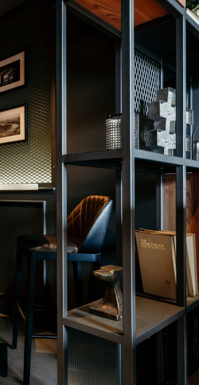
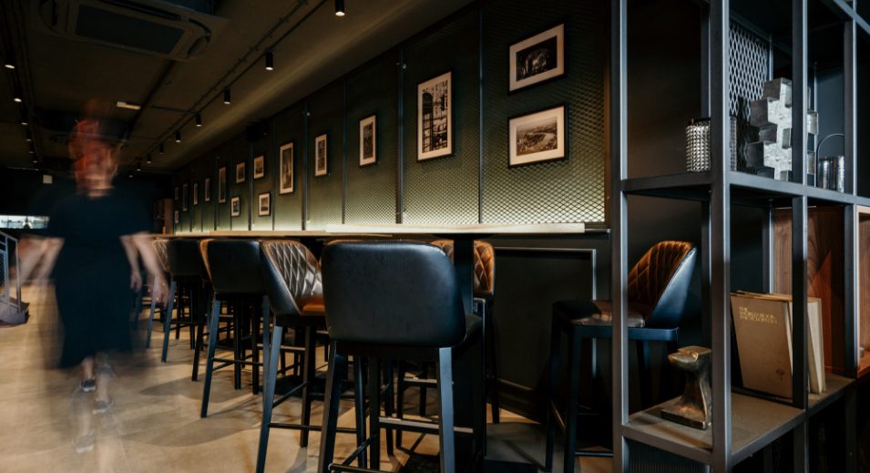
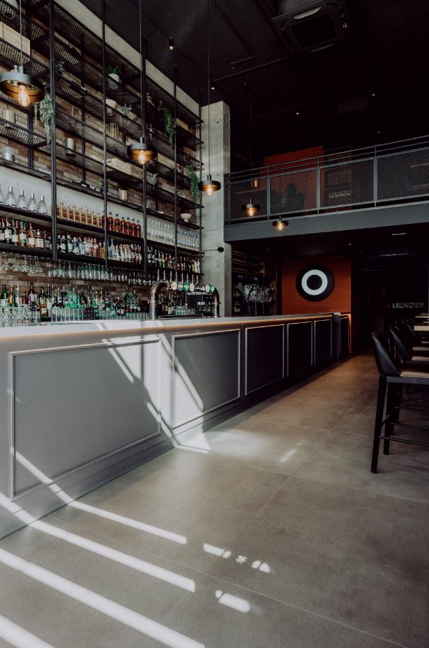
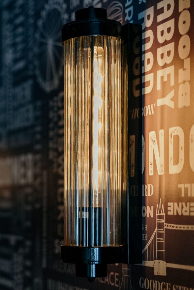
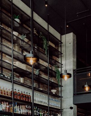
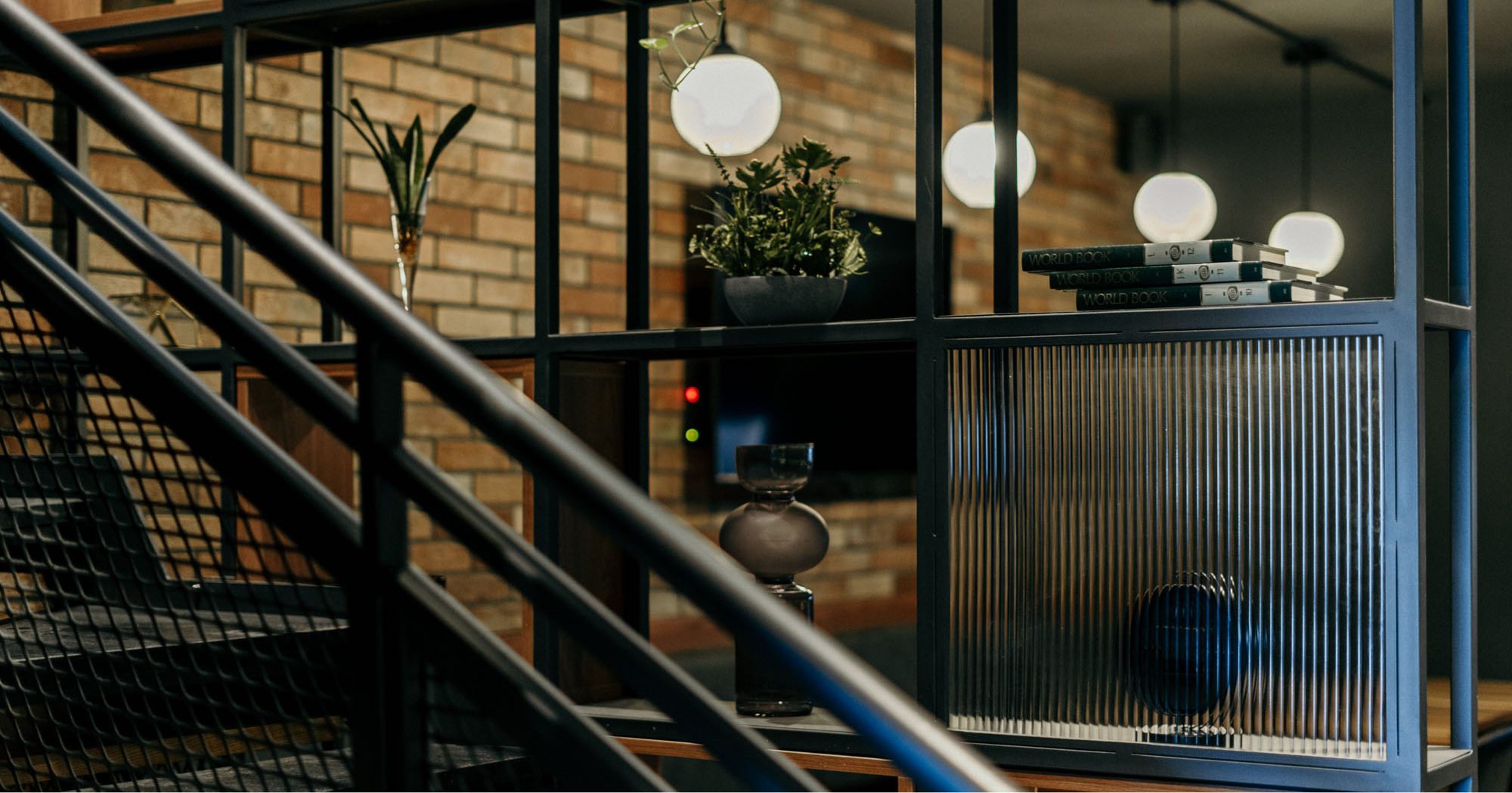
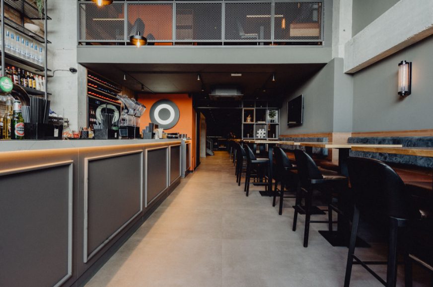
Pursuing on what the client had already built during the years with the Londoners British Pubs in Paceville and  Smart City, the franchise journey carries on with the opening of a third outlet in the heart of Sliema. Keeping the main inspiration of the typical London pub, the uplifted design features more modern elements which create a contemporary twist focusing more on the modern urban part of central London. The entrance features an elongated bar area set in a double-volume space which creates a grand ingress inviting its guests. The general layout was focused on the users’ experience having the front area primarily based on the use of high tables which cater as a lounge area, while the back area and the mezzanine allow the visitors to have a cosier vibe to dine in. Open metal libraries were used to create zones, while retaining the open plan. The design features the use of raw materials such as the exposed concrete columns, the gun-sprayed metal for the libraries, and the typical red brick commonly used in construction in London. The industrial style of the design was contrasted with a dark colour palette, modern lighting elements and soft-touch materials such as light wood, fabrics, and leather. The combination of such materials led to a well-balanced space which infused the classic pub with a warm modern space where people socialise. Due consideration was given to today’s social media generation whereby an area in the bathroom was specifically designed as a selfie spot which contributes to free promotion for the pub.
Project Londoners
Industry Restaurant, Bar
Services Interiors, Branding
Year 2022

Londoners

Pursuing on what the client had already built during the years with the Londoners British Pubs in Paceville and  Smart City, the franchise journey carries on with the opening of a third outlet in the heart of Sliema. Keeping the main inspiration of the typical London pub, the uplifted design features more modern elements which create a contemporary twist focusing more on the modern urban part of central London. The entrance features an elongated bar area set in a double-volume space which creates a grand ingress inviting its guests. The general layout was focused on the users’ experience having the front area primarily based on the use of high tables which cater as a lounge area, while the back area and the mezzanine allow the visitors to have a cosier vibe to dine in. Open metal libraries were used to create zones, while retaining the open plan. The design features the use of raw materials such as the exposed concrete columns, the gun-sprayed metal for the libraries, and the typical red brick commonly used in construction in London. The industrial style of the design was contrasted with a dark colour palette, modern lighting elements and soft-touch materials such as light wood, fabrics, and leather. The combination of such materials led to a well-balanced space which infused the classic pub with a warm modern space where people socialise. Due consideration was given to today’s social media generation whereby an area in the bathroom was specifically designed as a selfie spot which contributes to free promotion for the pub.
Client Londoners
Industry Restaurant, Bar
Services Interiors, Branding
Budget
Year 2022

Related Projects